Web design is an ever-evolving field. Generating a WOW user experience through creative websites is the focus of companies nowadays. It has led to revolutionary changes in trends of web design and development over the past few years. A pervasive trend that we notice is web designers experimenting with designs and breaking the mundane barriers of old times of bulky websites loaded with content in dull colours.
Web Designers Experiment More Now
The prevalent playfulness with designs is making websites more interactive, artistic, and easily navigable. The future is taking inspiration from the past and we can see a mix of contemporary and old website designs that include a splendid spread of stylish bold typography, vibrant hues, more lines and grids, fewer words, and suave textures. Web designers are also moving to advanced techniques such as human-like bot interactions, animations, and the latest visual effects of glassmorphism. Another shift that is being witnessed is web designers making use of no-code tools to improve the speed and efficiency of web designing and development.
The recent transformation of the world of web design has led to the springing up of various new web design and development courses in Canada. These courses teach you the basic knowledge of web design and how to use innovative techniques to keep your website up-to-date and rank high on Google search. While searching for a web design course online, you can keep in mind whether its curriculum encompasses the trending topics in that field. It’ll help you get ready to enter the field as soon as you graduate. Let’s read about the web design trends that are shaping the web design and development industry these days.
Top Web Design Trends to Look For in 2022
The core aspects of web design remain intact 一 load time, data security, and easy navigation. But it’s essential to update your website regularly with fresh content and design to stay on top of search engine rankings. You can do so by simply incorporating some of the web design and development trends that are keeping web designers busy globally.
Some of the top seven web design and development trends are:
- Bigger, Brighter, Bolder
- One Page Website
- Minimalism
- Scrollytelling
- Abstract Graphics
- The Line Effect
- Voice-driven interface
Let’s delve deeper into each trend that you should keep an eye on:
Bigger, Brighter, Bolder
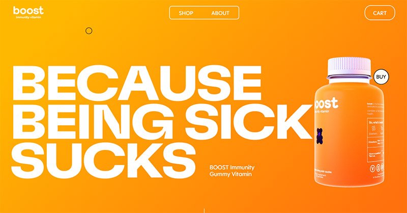
Web designers are making the websites unique by using bigger, bolder, and animated fonts with vibrant backgrounds. The days of greys and dull colours are out, with the websites becoming brighter, sharper, and more innovative in design. The text is getting enlarged across the website and saturated colours are used to create the desired impact on the target audience. It surely makes your website stand out from the rest and invokes user interest.
Boost, the immunity building product company, uses all the design components mentioned above and its website gains attention. The sparkling orange colour with bold letters and creative graphics make it attractive.
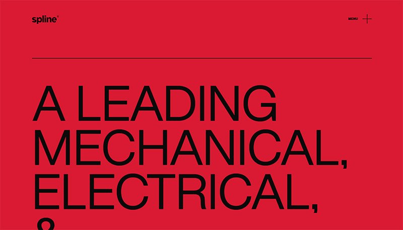
Another such example of a website using bold and bright colours and emphasizing typography is Spline, the mechanical and electrical engineering firm. It has coloured its homepage red with the colour changing to black and white as you scroll down.
One-page Website
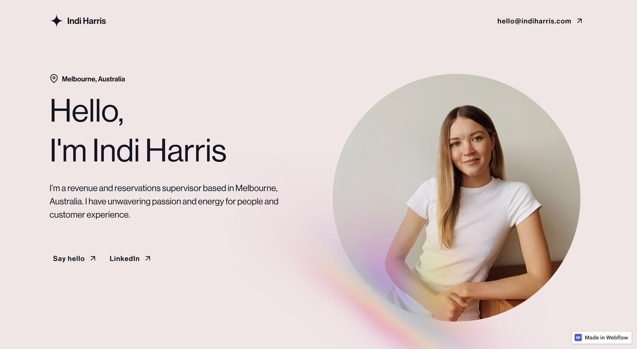
It’s time to embrace simplicity again! Companies/individuals have been turning to one-page websites as it adds an elegant and creative feeling to them. The trend of creating one-page websites is rising with more companies and individuals adopting it. The design is simple, straightforward, and the page encompasses the required information to keep the audience hooked. It has easy scroll navigation and everything right there under one roof. One-page websites also tickle the creative buds of web designers as they get to come up with unique designs to put the most important things on top, and place the rest in order so as not to make it look crowded.
For example, the website for Indi Harris (built by Jordan Hughes) reflects simplicity and creativity artistically. The focus here is on the subject and the services that she provides. Her digital resume is presented in a pithy manner making it easily accessible to the users.
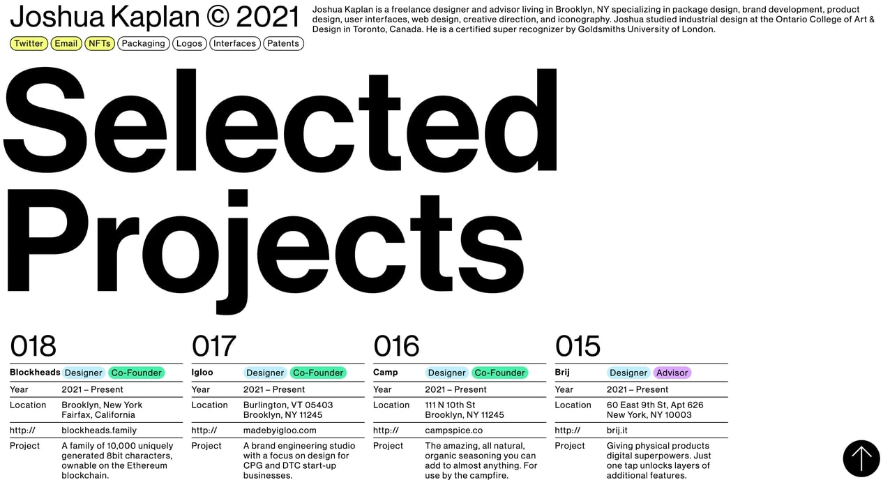
Another example is the portfolio website of Joshua Kaplan. The content is well-structured and organized in a simple manner. He has used bold text and displayed his work portfolio in a neat way for easy navigation.
Minimalism
True to its element, websites with minimum content, no hero images, and limited graphics are becoming very popular for good reasons. Minimalism is also called “flat design” and it has been used earlier by enterprises to convey more with less (look at Apple’s website). However, now the trend is taking inspiration from the olden days and we can see more play with colours reflecting minimalism.
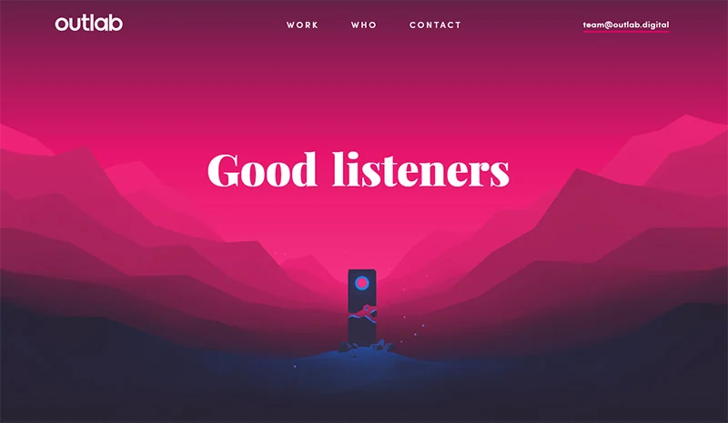
A good example of minimalist design is the website of Outlab, a design and development company. It uses vibrant hues to catch the eye and display its work. Navigating to other pages is also a treat with a zooming effect reflecting on the creativity of the designers.
Scrollytelling
The conglomeration of scrolling and storytelling is known as scrollytelling, and it has been catching up in the web designing world at a fast pace. Websites that tell a story while we scroll are being favoured by companies. It is an innovative way of captivating the target audience through an interesting story using a digital interface.
The process of scrollytelling is also known as “narrative visualization”, which means that the web designers weave together multiple visual elements in a chronological manner to offer content that appeals to the audience with the desired message.
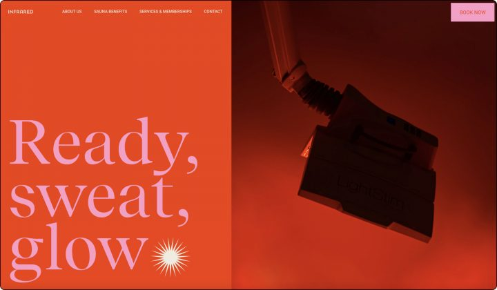
A unique example of this technique is Infrared Mind Body from Texas, US. Its website portrays huge images and bold texts in rich colours, seamless transitions, making it a clean sweep of web designing innovation.
Abstract Graphics
Graphics and illustrations are essential to make a website or any content look appealing. But lately, web designers have gone experimenting with abstract art as it gives them a chance to mix ‘n’ match various elements to produce desirable results. The use of scribbles, hand-made drawings, solid textures, and various shapes and sizes 一 all make for interesting contrasts in the digital arena.
Look at these blog post illustrations by designer Adam Ho to get an idea of how abstract illustrations are being used to add life to designs. The creative complexities in these designs make them spectacular with intricate use of ultra-thin lines and shapes. Surely eye-catching!

The Line Effect
Lines can add depth to your website content, giving it a clear distinction of what needs to go where, as per its importance. You can segregate the sections using linework and enhance its design display. It also adds more visual weight to the design making it almost an app-like experience for the users. It helps bring the context to the fore just like in a newspaper or magazine. Linework also helps create grids for the website structure and delineate segments, titles, product categories, and paragraphs.
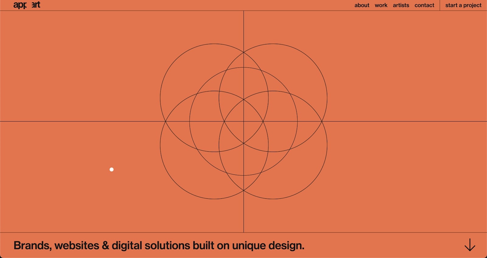
A good example to look at is Appart Agency’s website which uses ultrafine lines. With a subtle play of black, orange, and taupe colours, the designers have tried to give a contrasting yet sharp effect. The horizontal and vertical lines make it interesting to scroll through, and the design is minimalistic as well.
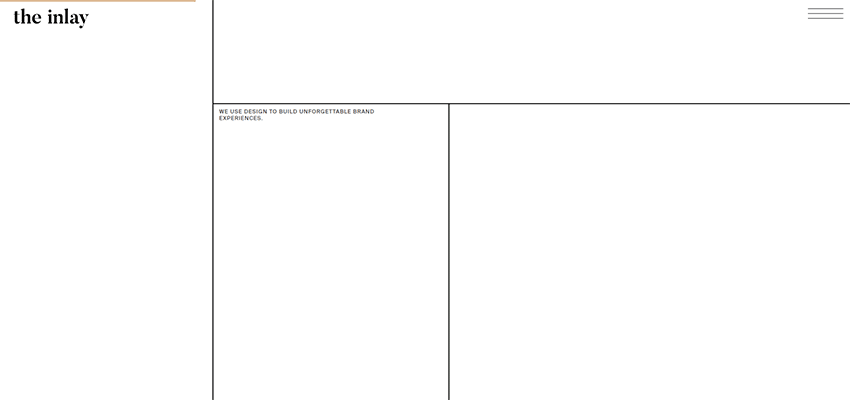
Another creative example of a website using linework is The Inlay. It has built various parts within the website using simple lines and utilizing the white space properly. There is enough space, very little content, and a lot to explore. It brings a fresh feel to the design with its lightweight aesthetics. Linework is surely becoming a rage with web designers.
Voice-driven Interface
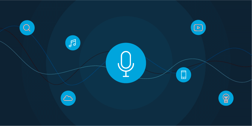
The next trend to look out for is the increasing use of voice-driven interfaces to access information on a website. Just like on Google, where we speak it out when we want any details, the same model is being integrated into corporate websites. Virtual assistants and voice chatbots are seen as the new trends in web designing. Though it is still yet to be further explored, it is expected to catch up with the web design trends in the near future. More and more websites are likely to incorporate voice search as an easy option for sharing information instead of the traditional type of search method.
Conclusion
The above-mentioned web design and development trends are sure to turn the scene around in the industry. As web designing progresses toward integrating more technological advancements such as artificial intelligence, virtual reality, and app-like experience, it’s just a matter of time before we would see a complete transition to such processes.
Web design online courses help you achieve a better understanding of the ongoing trends and prepare you to work in the field. ABM College’s Web Design and Development Diploma offers industry-relevant knowledge and enhances your skillset to make you job-ready.
Want to learn more about how you can begin a rewarding web designing career?
Contact us now!
Visit our blog for interesting employment and education tips.
About The Author

Private Career College
ABM College is a leader in career-focused education, committed to empowering students with industry-relevant skills. With expert instructors and practical training, ABM College delivers high-quality programs in health, business, technology, and more, ensuring graduates are prepared to meet workforce demands. Known for its supportive learning environment and a focus on real-world application, ABM College is a trusted educational partner helping students achieve professional success across Canada.
